Garage & Vehicle Tree


The Stamp Collection
| ROLE | Senior UI Artist (Visual Designer) & Lead UI Artist (Visual Designer), UX Design (unofficially) |
| TEAM | 3 Technical UX Designers, 1 UX Designer, 2 UI Engineers, 2 Visual Designers |
| TIMEFRAME | Q3 2015 -Q3 2018 |
| PLATFORM | PC, PlayStation, Xbox |
| CONSTRAINTS | An evolution of World of Tanks for a western audience |
| SCOPE | Planned 5 Year Development Cycle, Cancelled at 3 |
| OUTCOME | Project Cancelled |
The Problem
The 2015 World of Tanks garage was built for a market that had since changed. It read as clerical work, with none of the appeal of collecting and tuning modern armor. Every screen showed every detail at once, and it made little distinction between a new player’s needs and a ten-year veteran’s. The visual language was built for an Eastern market, and the audience was becoming Western. The menus looked like Windows 95: dense grids, little hierarchy, no filters, no sort.
First Principles
Two things had to hold true on every screen. First, the fantasy was collecting, tuning, and progressing modern military vehicles, and every screen either advanced that or stayed out of the way. Second, the vehicle was the hero, with personality and identity, not a row in a table.
Process: Prose Before Pixels
Before any layout work, I wrote critical flows as player-facing prose instead of wireframes:
- A new player opening the garage for the first time.
- A World of Tanks veteran arriving deep in an existing progression line.
- A player optimizing item selection, deciding what to buy or research next.
- Players filling different archetypes (brawler, sniper, support, flanker, generalist) who needed different tools to find their vehicle.
Writing these first forced the interaction design to answer to player intents instead of screen real estate. On paper, this role sat under UI ownership. In practice, most flow-level UX decisions ran through it, alongside the team’s three technical UX designers and one UX designer. The output became a working annotated spec: states, triggers, and copy for every card, panel, and flow. It also served as the first pattern set for the broader design system.
Comparative Analysis
The working reference set came from outside tank games: anything that had already solved how to make a large catalog of vehicles feel desirable. Forza and Gran Turismo showed what ownership feels like, as opposed to inventory. Battlefield and Overwatch set the polish and pacing a Western, entertainment-first audience expects from a menu. Automotive retail sites and military enthusiast publications modeled how real hardware gets photographed, spec’d, and narrated when the goal is to make someone want it. The team’s shorthand: this is a car showroom, not a spreadsheet.


UX Patterns
The spec had to account for a large, non-linear tree, many different player intents, and a full lifecycle for each vehicle:
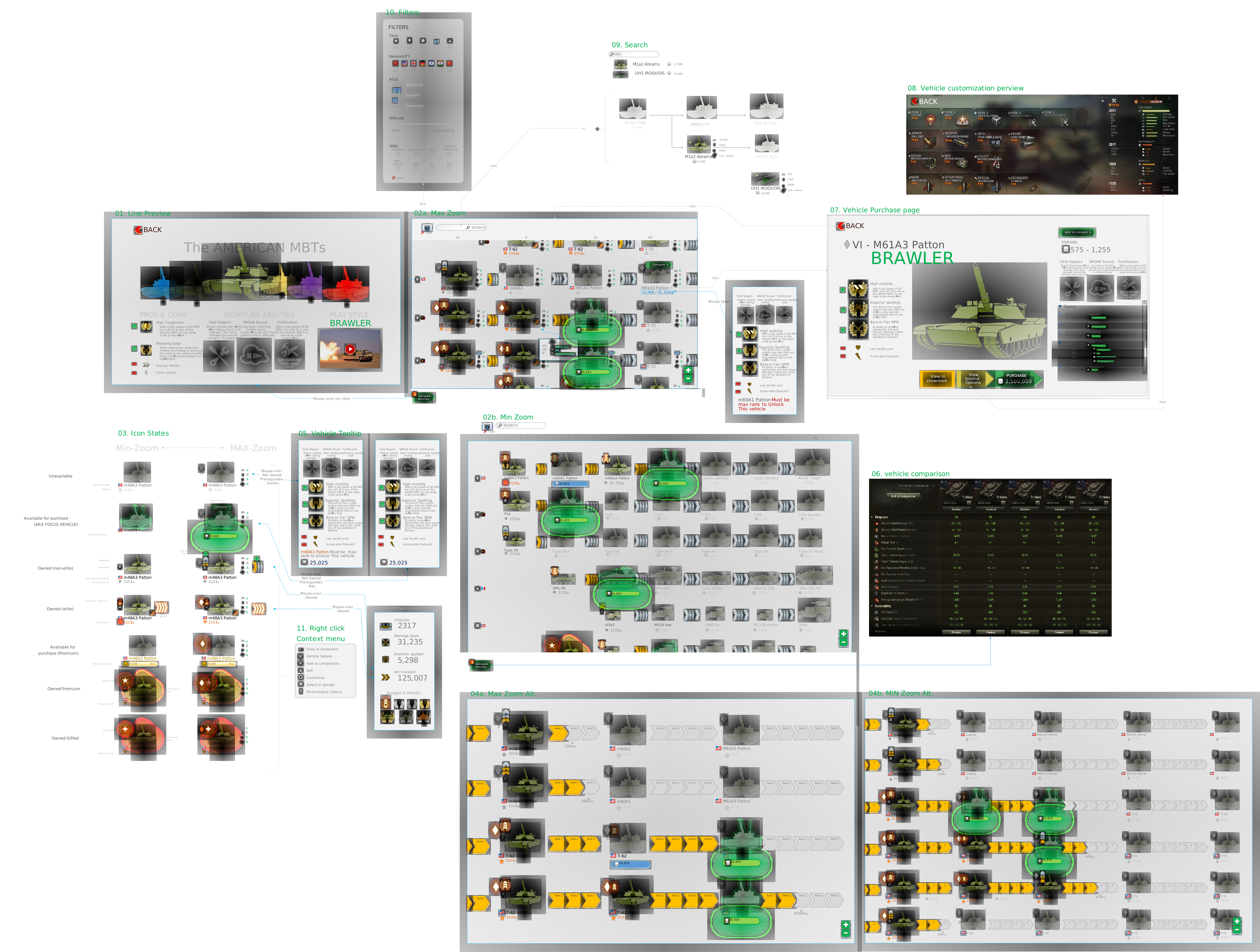
- Findability. Type-ahead search, plus filters for class, nationality, gameplay role (brawler, sniper, support, flanker, generalist), difficulty, and status (premium, elite, most played, new, rank-up available).
- Movement. Min-zoom and max-zoom states of the same tree, so a player could scan the whole line or move to per-vehicle detail without leaving the page.
- Seven ownership and availability states per vehicle icon: unavailable, available for purchase (focus vehicle), owned non-elite, owned elite, available for purchase (premium), owned premium, owned gifted. Each was legible at both zoom levels.
- Progressive disclosure on hover. A tooltip shows signature abilities and prerequisites first. A second mouse-over state reveals mini performance stats: victories, damage dealt, enemies spotted, distance traveled, badges and medals.
- A right-click context menu for view in showroom, vehicle details, add to comparison, sell, customize, select in garage, and performance history, so common actions needed no page change.
- Side-by-side comparison across firepower and survivability stats for multiple vehicles at once.
- A dedicated purchase page that led with the vehicle’s archetype (e.g. “Brawler”), signature abilities, and specs before price, with direct paths into the showroom or loadout customization.
The Working Spec
The annotated flow below is the working document: eleven numbered states and interactions, from line preview and zoom levels through filters, search, tooltips, comparison, purchase, and loadout customization.
Designing the Showroom
The garage had to be the game’s main driver of investment and progression, like a showroom floor:
- Merchandise the vehicle. Present it as worth the time, effort, or money to acquie.
- Make stats legible and comparative. Show each vehicle’s stats and how it compares with others, with no spreadsheet needed to read them.
- Make rank legible. Communicate progression state clearly enough to invite the next step, instead of only recording it.
- Show combat pedigree. Decorations and achievements earned in battle appear on the vehicle itself.


Acquisition
Buying or unlocking a vehicle needed to feel lively and celebratory while staying on theme for a military hardware fantasy. We created one shared acquisition event for all purchased vehicles. Each vehicle would likely have received its own treatment, given how much the moment mattered, but the shared event was still an important interim step: it let the project see a celebratory moment. I authored all assets and the Adobe Flash motion, and one of our technical UX designers implemented them.
Outcome
The program was planned as a five-year development cycle across PC, PlayStation, and Xbox, and was cancelled at year three. The interaction patterns and state logic documented here (ownership states, comparison tooling, progressive disclosure, the showroom framing) became the first patterns of the broader design system, regardless of the project’s outcome.